
Redesigning a subscription dental clinic's website to explain the model and convert visitors.
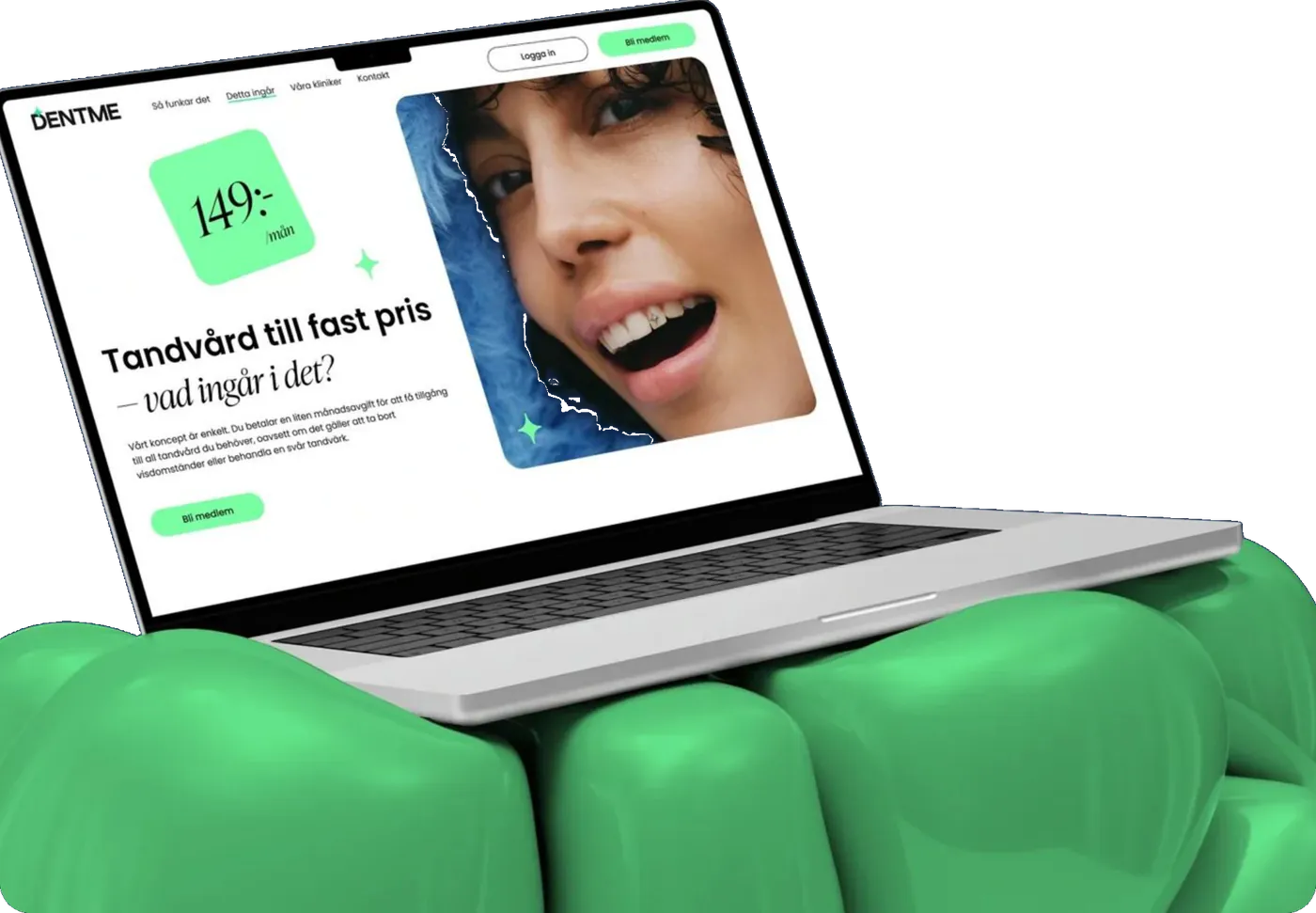
UX/UI audit, new design concept, interactive prototype and a React, Next.js and Payload CMS build for DentMe in Sweden.
01 Executive summary
DentMe's dental care model was new. Its website had to explain it clearly and turn interest into memberships.
Client and market
DentMe is a Swedish dental clinic that offers dental care by subscription: members pay a fixed monthly fee for treatment, including preventive care.
Challenge
The existing site, built by another vendor, was not meeting conversion goals. Visitors did not clearly understand the offer, and the clinic needed a fix under tight deadlines.
Product
A responsive marketing and membership website built on React and Next.js, managed in Payload CMS, and connected to DentMe's existing backend and booking engine.
What Digital Growth Labs delivered
- A UX/UI audit that documented the gaps hurting conversions
- A new design concept and a high-fidelity interactive prototype
- A responsive website on React, Next.js and Payload CMS, integrated with the existing backend
- Tracking, analytics and SEO: Google Tag Manager, Hotjar, Facebook and TikTok pixels
7
Specialists on the team
4
Issue areas found in the audit
1,000+
Applications the clinic had received before the relaunch
4
Tracking and analytics tools integrated
Attribution. Digital Growth Labs delivered the DentMe website redesign as white-label delivery partner to SolveIt, where this project is also published.
02 The challenge
Visitors didn't clearly understand the subscription, so the website wasn't converting.
DentMe removes the financial and administrative barriers of dental care with one fixed monthly fee. But the website it already had, delivered by a previous vendor, was falling short of its business goals, especially on conversions.
Prospective members
Need to understand what a monthly subscription covers, and trust a new model, before joining.
DentMe's marketing team
Needed better tracking to optimise ad campaigns, retarget visitors and understand behaviour.
DentMe's leadership
Needed a site that met stakeholder expectations and could support the story told to investors.
What the UX/UI audit found
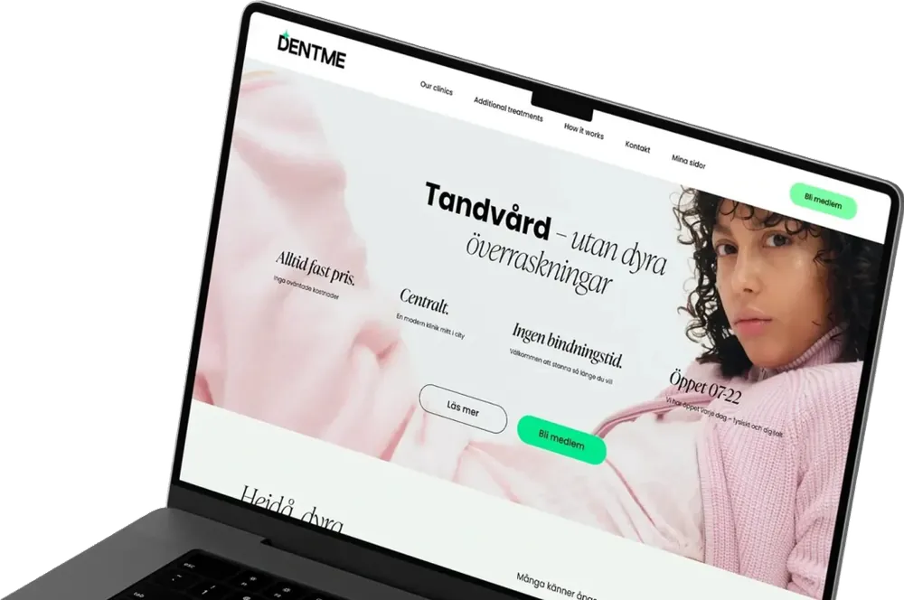
The audit was led by a chief design officer and a business analyst. The existing design lacked consistency and energy.
- Mismatched colour tones
- Contrast issues
- Accessibility non-compliance
- Unclear sales-funnel UX
The issues were documented in detail, which helped DentMe see the need for a full redesign.
Core problem
A genuinely new way to pay for dental care was being presented in a way that didn't make its value obvious, at the moment the clinic most needed sign-ups.
03 Our approach
Audit, then design, prototype and build, with conversion as the measure at every step.
Each step tied back to one question: does a visitor understand the subscription and know how to join?
-
01
UX/UI audit
Reviewed the existing platform and documented inconsistent colours, contrast and accessibility problems, and an unclear sales funnel.
What it solvedGave DentMe clear evidence for investing in a full redesign.
-
02
Design concept
Proposed a new visual direction and user journey aligned with the subscription model, working from original references within DentMe's existing brand identity.
What it solvedA look that breaks from the typical clinic, without breaking the brand.
-
03
Structure and messaging
Made the home page the centre of the site: selling the product, explaining the subscription, and building trust through clear copy and social proof.
What it solvedVisitors meet the value of the offer first.
-
04
Interactive prototype
Built a high-fidelity prototype to visualise the user flow, then tested and iterated the journey before development.
What it solvedUX decisions validated before code was written.
-
05
Build and integrations
Developed a responsive site on React and Next.js with Payload CMS, connected to the existing backend for payments and accounts, and to the booking engine.
What it solvedA fast, scalable site that works with DentMe's existing systems.
-
06
QA, tracking and SEO
Ran full testing of the backend and booking integrations; added Facebook and TikTok pixels, Google Tag Manager and Hotjar; optimised for SEO from launch.
What it solvedA reliable launch that could be measured and improved.
03 Design process
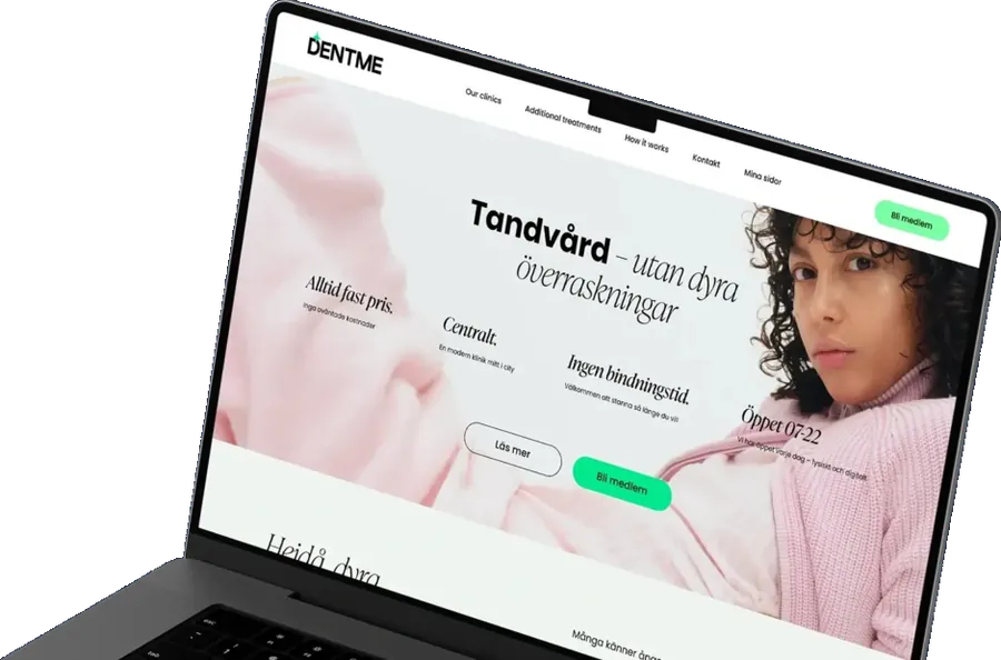
The brief: no white coats, no sterile visuals, no pay-per-visit feel.
DentMe wanted to break away from the traditional dental clinic image. Three constraints shaped how the redesign got there.
No template to follow
There was no benchmark for a modern subscription dental service, so the team gathered original references to build a fresh concept.
An established brand
The design had to stay within DentMe's visual language, already used in print and other brand assets.
Tight deadlines
The clinic was already open with over 1,000 applications, so design and development had to move fast.

Working inside the brand
Staying within DentMe's established visual language limited creative freedom, but kept the website consistent with the brand across print, the clinic and online.
04 The product
One site that sells the membership and gives the team the tools to improve it.
Visitor
Becoming a member
Land on the home page
Fixed monthly price and call to join up front
See what's included
Treatments covered by the subscription
Build trust
Clinics, team, member reviews and FAQ
Become a member
Join, book and pay through existing systems
The new Next.js front end connects to DentMe's existing backend and booking engine for bookings, payment processing and account management
DentMe team
Running the site
Edit content
Pages managed in Payload CMS
Run campaigns
Facebook and TikTok pixels for retargeting
Measure
Google Tag Manager, Hotjar heatmaps, scroll maps, recordings
Optimise
Journey insights inform ongoing changes
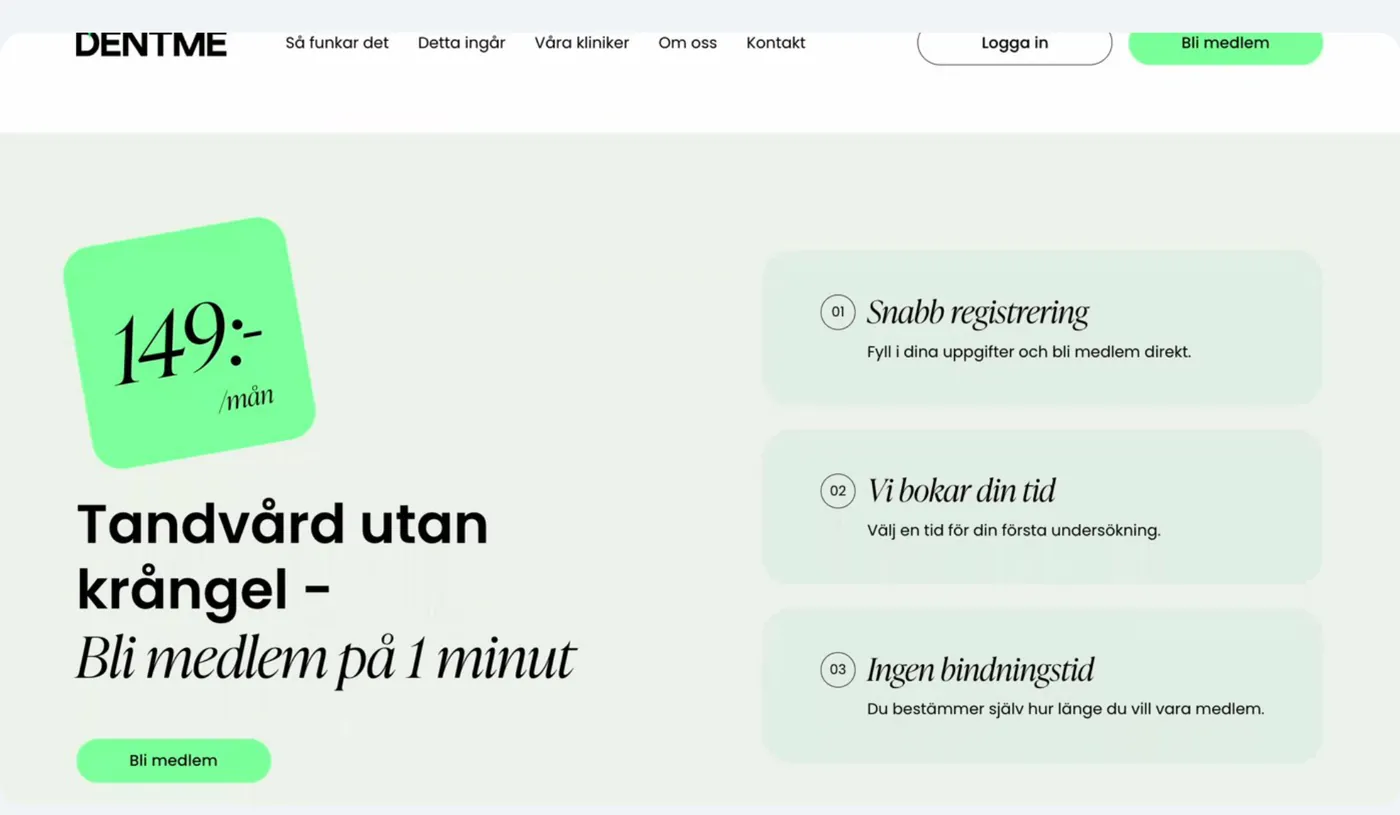
04 Key screens
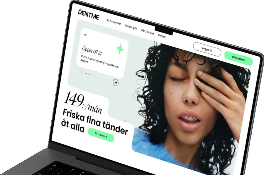
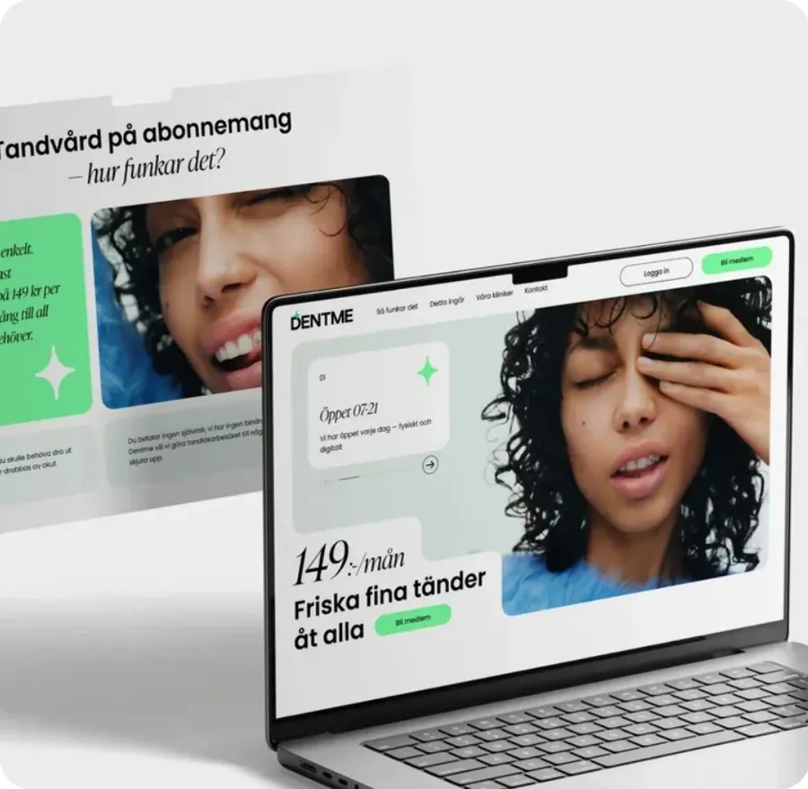
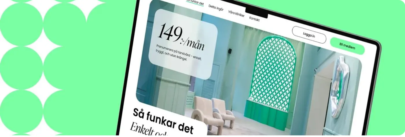
The home page tells the whole story, section by section.
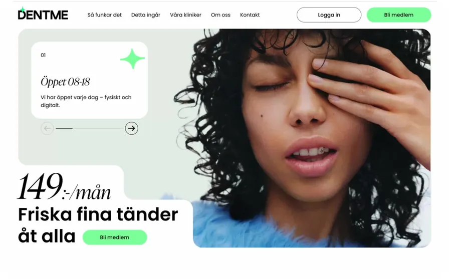
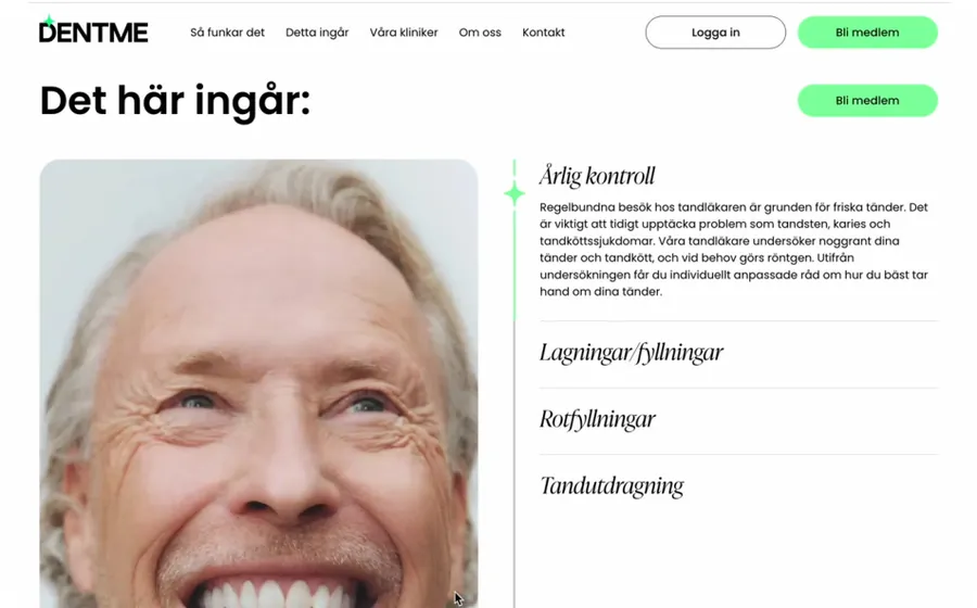
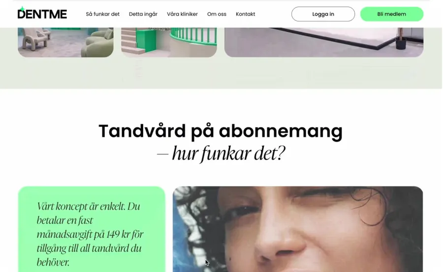
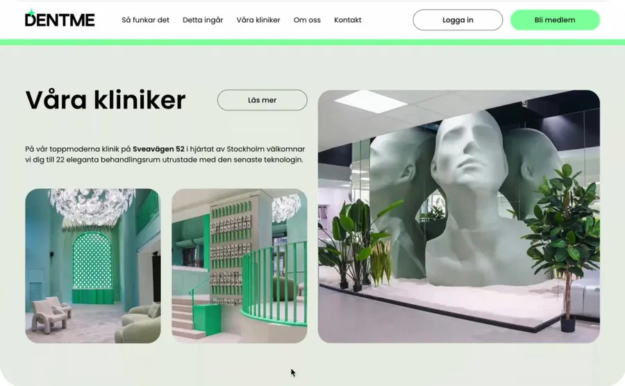
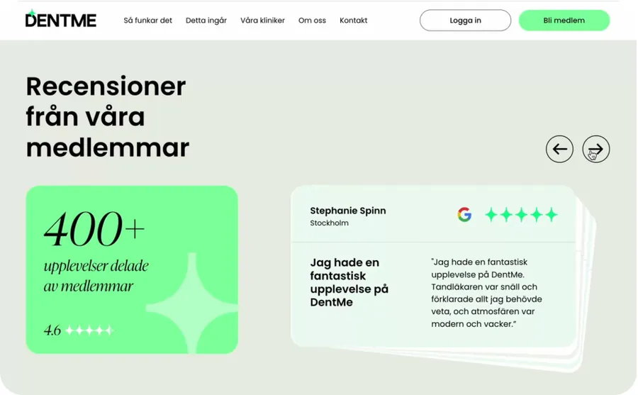
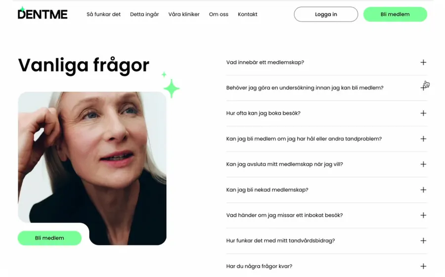
Frames from SolveIt's published screen recording of the redesigned home page.
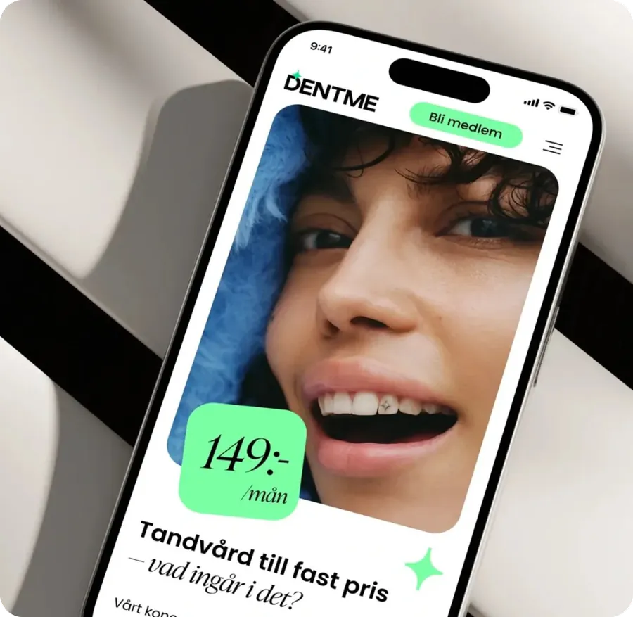
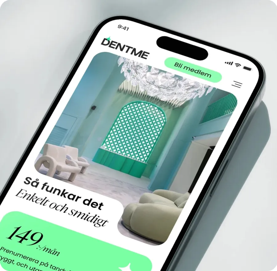
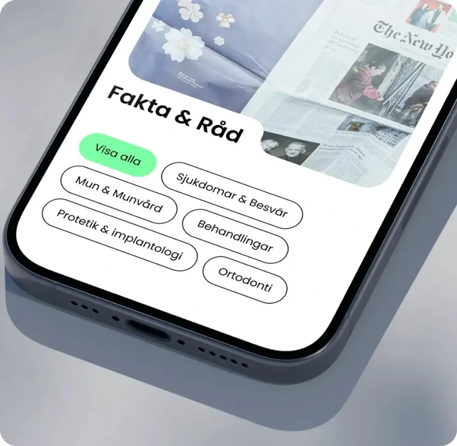
04 Mobile experience
Fully responsive, with the same clarity on a phone.
05 Engineering
A modern front end on top of the systems DentMe already ran.
Experience
Responsive website
Desktop
Full home page and membership journey
Tablet
Same content, adapted layout
Mobile
Pixel-perfect responsive build
Front end and content
Next.js front end
Pages, components, motion and tracking
Payload CMS
Content management for the site
Existing systems and services
DentMe backend
Accounts and payment processing
Booking engine
Existing booking software
Adyen
Payment processing
Tracking
GTM, Hotjar, Facebook and TikTok pixels
Delivery and monitoring
Docker
DevOps and infrastructure
Sentry
Monitoring and error tracking
React, Next.js and a CMS
The site was built on React and connected to a CMS for a scalable, fast and secure platform the team can update.
Integrated, then fully tested
Full testing confirmed the new site worked with the existing backend system and the booking software engine.
Measurable from launch
Pixels, tag management, heatmaps and SEO were in place from the start, so optimisation could begin immediately.
05 Stack and decisions
A focused stack, and decisions made to protect the conversion goal.
- Front end
- React, Next.js, TypeScript
- CMS
- Payload CMS
- Styling and motion
- Framer Motion, clsx
- UI components
- Swiper
- Payments
- Adyen
- Monitoring
- Sentry
- DevOps
- Docker
- Analytics
- Google Tag Manager, Hotjar
- Marketing pixels
- Facebook, TikTok
- Integrations
- Existing backend, booking engine
- 01
Start with an audit
Documenting the existing site's problems gave the redesign a clear brief and showed DentMe why a full redesign was worth it.
- 02
Prototype before building
Testing and iterating the user journey in an interactive prototype meant development started from a validated flow.
- 03
Make the home page the sales page
The home page carries the product story: the value of the subscription, what's included, and proof from real members.
- 04
Keep the existing backend and booking engine
The new site connects to DentMe's existing systems for payments, accounts and bookings, with full integration testing.
- 05
Instrument everything from day one
Pixels, Google Tag Manager, Hotjar and SEO shipped with the site, not as a later project.
06 Key capabilities
Six capabilities behind the redesign.
A home page built to sell a subscription
Clear copy and text blocks, emotional triggers and social proof explain the monthly model, what it includes and why to trust it.
ValueVisitors understand the offer before they are asked to join.
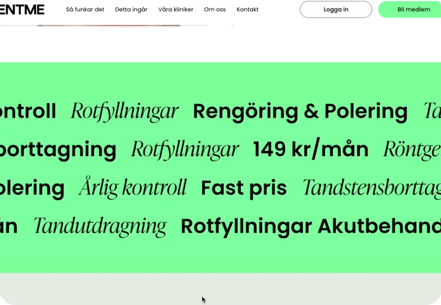
Motion that invites exploration
Smooth transitions, hover effects and scroll microinteractions, built with Framer Motion, were a client requirement for a modern, engaging feel.
ValueA site that feels as fresh as the clinic's concept.
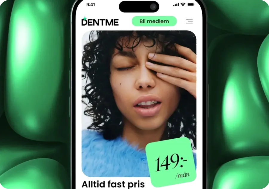
Social media pixels
Facebook and TikTok pixels help the marketing team optimise ad campaigns, retarget visitors and track behaviour more precisely.
ValueBetter retargeting and campaign analytics.
Heatmaps and recordings
Google Tag Manager and Hotjar collect heatmaps, scroll maps and session recordings to map the customer journey.
ValueEvidence for ongoing optimisation.
Payments and accounts
The site connects to DentMe's existing backend for payment processing and account management.
ValueMembers join and pay without a new system.
SEO from the start
The new website was SEO-optimised from launch to improve visibility and attract organic traffic.
ValueAcquisition beyond paid campaigns.
07 Results and impact
After launch, DentMe reported more bookings and better engagement.
Results below are client-reported, from the review by DentMe's Head of IT published on SolveIt's case study. No figures have been published.
Conversions
Noticeably improved after launch
More users completing bookings and engaging with key calls to action.
Bounce rate
Decreased
Client-reported.
Sessions
Session duration increased
Client-reported.
Mobile
Usability scores improved
Reported as improved across the board.
On schedule
Delivered despite tight deadlines
Full UX/UI redesign, development, testing and integrations, as published by SolveIt.
Growth
Support for next funding rounds
SolveIt reports the site met current needs and strengthened DentMe's position for investment.
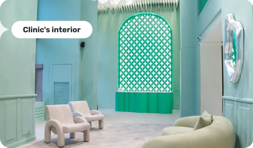
Online and offline, one experience
SolveIt describes the redesigned site as bridging the digital journey and the clinic visit, so moving from browsing to booking feels like part of the same experience.
07 Delivery
A seven-person team delivered the redesign under tight deadlines.
Timeline
The source confirms the work was delivered on schedule under strict timelines.
Services
- Website redesign
- Web development
- QA
Deliverables
- Documented UX/UI audit
- New design concept and user journey
- High-fidelity interactive prototype
- Responsive React and Next.js website with Payload CMS
- Backend, booking, tracking, analytics and SEO integrations
- Support for DentMe's investor communications
Team
7specialists
- Audit lead Chief design officer
- Audit lead Business analyst
The audit leads named in the source.
Client review
“We saw a noticeable improvement in conversion rates after launch”
08 Why it worked
Five decisions turned a new business model into a website that converts.
- 01
Evidence came before design
A structured audit identified exactly what was hurting conversions, from contrast and accessibility to an unclear sales funnel.
- 02
The home page was built to sell
It became the centre of the site, explaining the subscription, what it includes and why to trust it, with social proof throughout.
- 03
The journey was validated early
An interactive prototype let the team test and iterate the flow before development under tight deadlines.
- 04
New front end, existing systems
React, Next.js and Payload CMS connect to DentMe's backend and booking engine, with full integration testing.
- 05
Measurement shipped with the site
Pixels, Google Tag Manager, Hotjar and SEO gave DentMe the data to keep improving after launch.
The goal was never just a new look. DentMe needed a website that made an unfamiliar model easy to understand and easy to join. An evidence-based audit, a tested journey and built-in measurement were the foundation for that.

Have a product idea?
Digital Growth Labs is a product design and engineering partner. We take complex product ideas from concept to launch.
New business
Online
Offices
- 1563 McClure Woodland CA 95776
The DentMe website redesign was delivered by Digital Growth Labs as white-label delivery partner to SolveIt, where the project is also published. Project facts in this document come from SolveIt's published case study.